The Converters Band
The Guidelines
This project spanned over several weeks and consisted of several key requirements. First, we were tasked with designing a logo for the local rock band, The Converters. We were given a target audience and who the primary demographic for the band is to base our designs off of. After several iterations, we were to create a variety of mockups and a final presentation showing them off. With each of the mockups, we were required to research places where the band would be able to purchase the actual product using the custom designs. During the entire process, we were expected to track our time spent on each task which would later be used to create an invoice delivering our quote for our work based on our pre-decided hourly rate.
Understanding The Audience
The first step to creating a logo requires understanding the core demographic. For the converters, we were told that their music is very similar to bands like Guns and Roses. We were also told that they have a heavy biker aesthetic. Using this information, I was able to begin designing my logo.
Creating The Logo
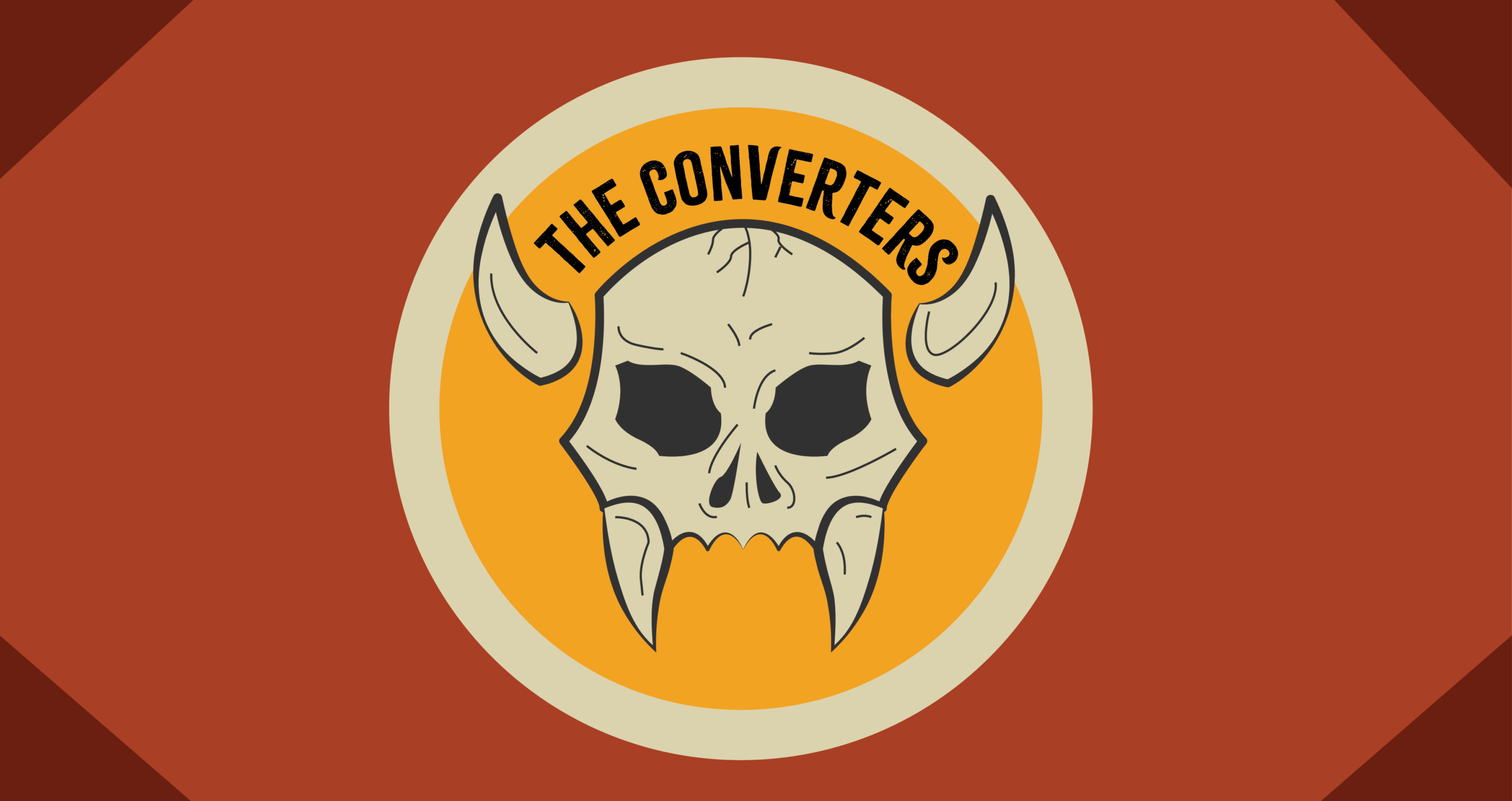
I knew early on that I wanted the logo to incorporate a skull, since it was very common imagery for the era of rock music that the Converters were inspired by. However, I wanted the skull to stand out among other bands which use skull iconography in their logos. Given the name “converters” I decided to incorporate an element from the blood sucking converters: vampires. I over exaggerated the fangs and added detached horns to nestle the text between.
Once I had finalized my design, I digitized it in Illustrator. I created multiple versions of the logo. I decided on a classic tan for the inner color of the skull and a dark grey for any linework and text.


Once I created my logo and was beginning to think about placing it on products, I decided to create a color scheme to pair with the logo.

Final Logo Variations
My final logo has a textured skull to add interest. I also have an additional variation with a orange backing circle for a pop of color. The second icon is useful for social media profile pictures and any merch that might need a more rounded logo.


Creating Product Mockups
We were expected to create product mockups for a beer mug, shot glass, t-shirt, mugs, hat, and several social media banners. I created several variations of the shirt and also designed a vinyl sleeve and record for the band. My mockups are seen below.


The Final Presentation
As the final step to this project, we were to create a slideshow presentation showcasing our finished logo, mockups, timesheet, and details on where to purchase the products. We were also encouraged to embed a song that matches the vibe of the Converters. My presentation can be seen below.
My Final Time Sheet and Invoice
Tracking out time was an important aspect of this project. It taught us how to not only manage our time but also gave us a better understanding of how to charge for our work and stay within budget. My final time sheet and quote is seen below in a branded invoice. My decided rate was $30/hour and the cost was calculated off of that.

Final Conclusion
This project was one that I really enjoyed. I, myself, am a fan of that style of music and was immediately excited to begin working on this assignment. I also learned a lot about time tracking, researching products, and staying within a budget. Overall, I am very happy and proud of how my designs came out.