GMW to Graphic Design Case Study
The Guidelines Part One
The current graphic design-based program at New England Institute of Technology is currently called Graphics, Multimedia, and Web Design (GMW). This Name is long and doesn’t well describe the program anymore. Because of this, a name change to Graphic Design (GD) has been pushed. For this assignment, we were tasked with creating a simple logo to represent the new department name that could be used for wayfinding purposes. Once a logo was created, we were to then design icons representing the primary subjections of the program. These icons could later be used to help show where certain sub programs took place.
The Initial Logo Designs


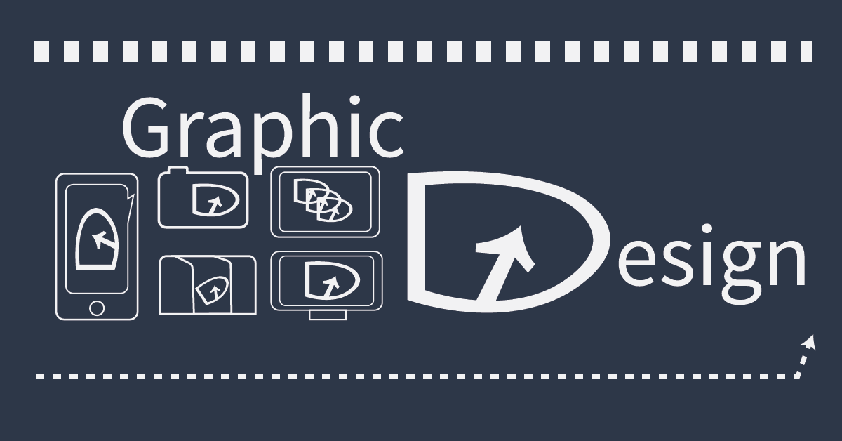
I began by creating three concept sketches. I eventually started developing upon one of designs until I was able to come up with a final design that I was happy with. I combined the G and D from Graphic design and used the negative space created by the mouse-inspired arrow to represent the inner portion of the G.
Designing the Icons

The First department I attempted was photography/ videography. I wanted to keep all of my icons relatively simple and similar in shape. I Decided to have the simple box have a small bump out in order to convey that it is a camera. Then I included my final GD logo to represent the lens of the camera.

Next, I tackled Package Design. This icon is probably one of my favorites. This design represents a box and I used the tape to add dimension while still keeping the design simple. The GD logo was incorporated by acting as a shipping label or logo on the box.

Creating the icon for Social Media/ Marketing was the most difficult. At first, I was unsure of how to represent the idea while still keeping the design consistent with my other icons. I ultimately decided on a rotated phone with the GD logo in a speech bubble. This design could be simplified more by removing the phone iconography entirely.

Similar to the Social Media/ Marketing design, the Web Design icon is represented with a screen. This time, it is a monitor because computers are most commonly associated with web browsing and web design.

My final icon design was for the Animation department. I represented this by creating a drawing tablet. The GD logo was incorporated in a way to convey movement and through frame-by-frame animation.
Animation
The Guidelines Part Two
The next portion of this case study required us to utilize our new logo designs in an improved navigation of the school. We were to analyze the school and determine how we could improve the building’s wayfinding and make it easier for people to find the Graphic Design suites. We would improve navigation by adding signage and eventually designing a digital kiosk that would display a map near the school’s main entrance.
Digitizing the Graphic Design Logo + Icons

I digitized the logo and icons in Adobe Illustrator. The digitized logos would be able to be used in signage leading up to and around the GD Suites.
Deciding Where to Add Signage


The stairs are an important landmark in the building and anyone entering through the main entrance would likely need to either pass or use them. Because of this, the stairs would be the perfect place to include directional signage. I decided to include the names of the departments located on the above floor on each step. This would allow visitors to know if they need to climb an additional set of stairs in order to find their destination.


The building is broken up into two wings and it is important to know which programs are in which wings. I decided it would be ideal to convey this by displaying the department logos above the archway with the wing label.
Creating a Map

The next step in the process was creating a map of the second floor which would help visitors navigate. This map would later be added to the digital kiosk. Every department on the floor and additional frequented areas such as restrooms and stairways are color coded.
Creating the Digital Kiosk

The final step in this part of the Case Study was the create a digital kiosk. The kiosk is intended to be displayed at the entrance of the building. When a visitor/ new student/ guest/ etc. walks into the building they will immediately see the kiosk. The kiosk is interactive, allowing the user to select which floor they would like to view and search up departments by name in order to receive directions. I also wanted the kiosk to be easily accessible without needing the user to bend down in an uncomfortable manor.
The Guidelines Part Three
The final portion of this Case Study required us to create a Wayfinding Pitch in the form of a presentation. This presentation was required to include our own branding as well as information about the project. My presentation can be seen below.